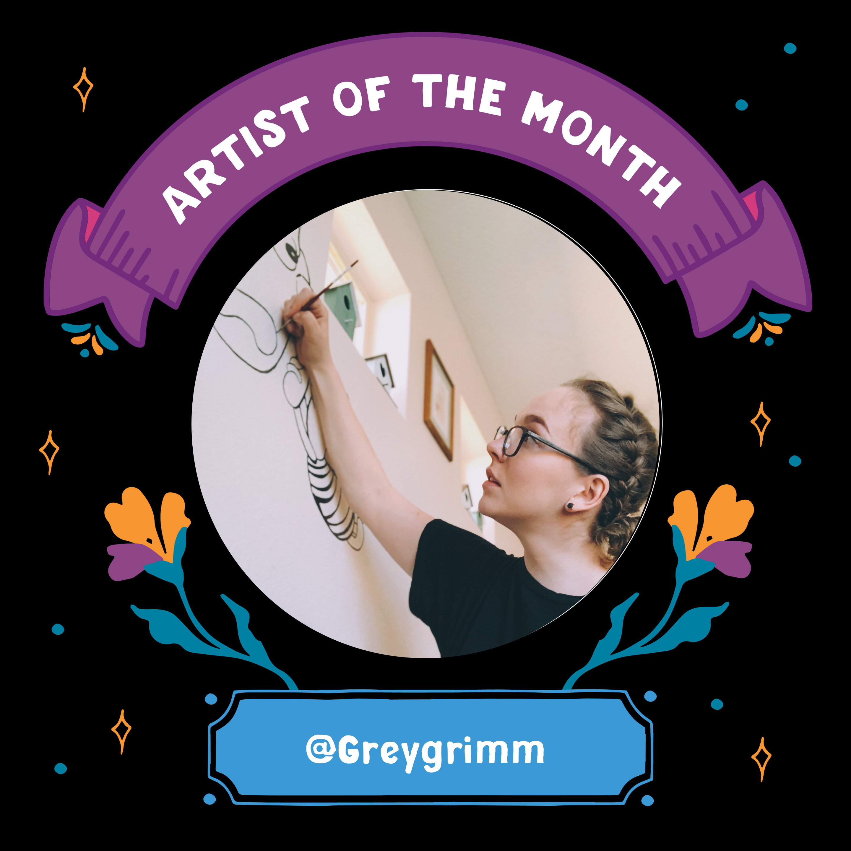
July Artist of the Month: @Greygrimm
VersaChalk Artist of the Month this July- @Greygrimm

Tell us a little about yourself. How did you get started?
I grew up in beautiful Boulder, Colorado (where I currently live and work), pressed up against the Rocky Mountains, specifically the Flatirons. Summers in the 90’s consisted of hot days and sunny skies with a pretty consistent rainstorm around 3pm, followed quickly by more sun and lazy evenings. This was still a time before cell phones were in everyone’s pocket, and computers were reserved for word processing. Don’t get me wrong, my family loves film and having family movie nights was a must, but when the sun was out, you were out; especially when mom was on a cleaning mission. We were told to go outside and stay outside until lunch, then again until dinner. This gave ample time to explore, make-up games, ride bikes and (if you were lucky enough to have a concrete-paved driveway) make sidewalk chalk masterpieces. I’d say this is where it all started; in my driveway with a box of sidewalk chalk—at that time, the coveted box was by Crayola, who had figured out how to make a 24-pack of colors (!) the tops of the chalk game.
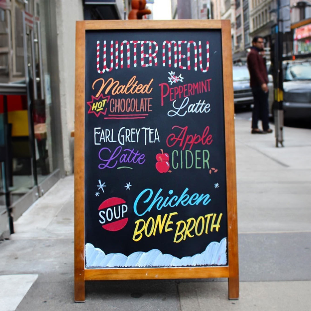
Following my time as a burgeoning child-chalk-master, I found myself working in hospitality. I worked in the restaurant industry from 2007-2020; and at one particular spot between the years 2007-2017. This restaurant had a chalkboard sign behind the bar that would display wine specials, featured menu items, events and holidays. I quickly became the chalkboard gal. I was the only person “allowed” to touch-up or re-do the board. Over the course of those ten years, my style improved and I figured out how to manipulate chalk like you might pastel. It wasn’t until early 2018 however, that I realized there was such a thing as a chalk marker; and this discovery changed the lettering game completely.
After this new-found obsession I started to perfect my style and honed in on what made a good chalkboard—one of those things being a lot of measuring and planning; never underestimate the power of a t-square and ruler.

There are a lot of wonderful things about lettering and calligraphy, but one that keeps me coming back is figuring out a new lettering style that fits with a theme or a description. I work with a local company in Boulder called Cocktail Caravan, which is a specialty bar service for weddings and events, essentially elevating what has traditionally been a pretty basic component (sometimes even afterthought) of event planning. Working with this type of company means that there’s a lot of variety of subject—while cocktails are the constant, the event specifics will change including the theme and/or personal requests. Having these varying components makes for a lot of experimentation with lettering styles and layout which in turn keeps interest piqued. I get to figure out how to best exemplify an Aperol Spritz in text, or how a specialty cocktail called the Frontier Fresca should be showcased. As they say, variety is the spice of life, and this is true for artists and letterers as well, especially when there is potential for a lot of repetition, particularly when talking about menus. Having a specialty in lettering and layout is something that has also translated to my other professional work, and has generally given me a greater appreciation for design as well as the benefit of a limited color palette.
What do you like to do in your spare time / Fun facts about yourself!
Email : greyrbgrimm@gmail.com

