How To Create Stunning A-Frame Chalkboard Signs Like a Boss
by Heather Martinez
Ever wish you could create one-of-a-kind A-frame chalkboard art like the pros? Let me share with you some of the best-kept secrets of the craft so you can be the chalk boss of your block!
1. Getting Started: Test Colors, Letters and Scale

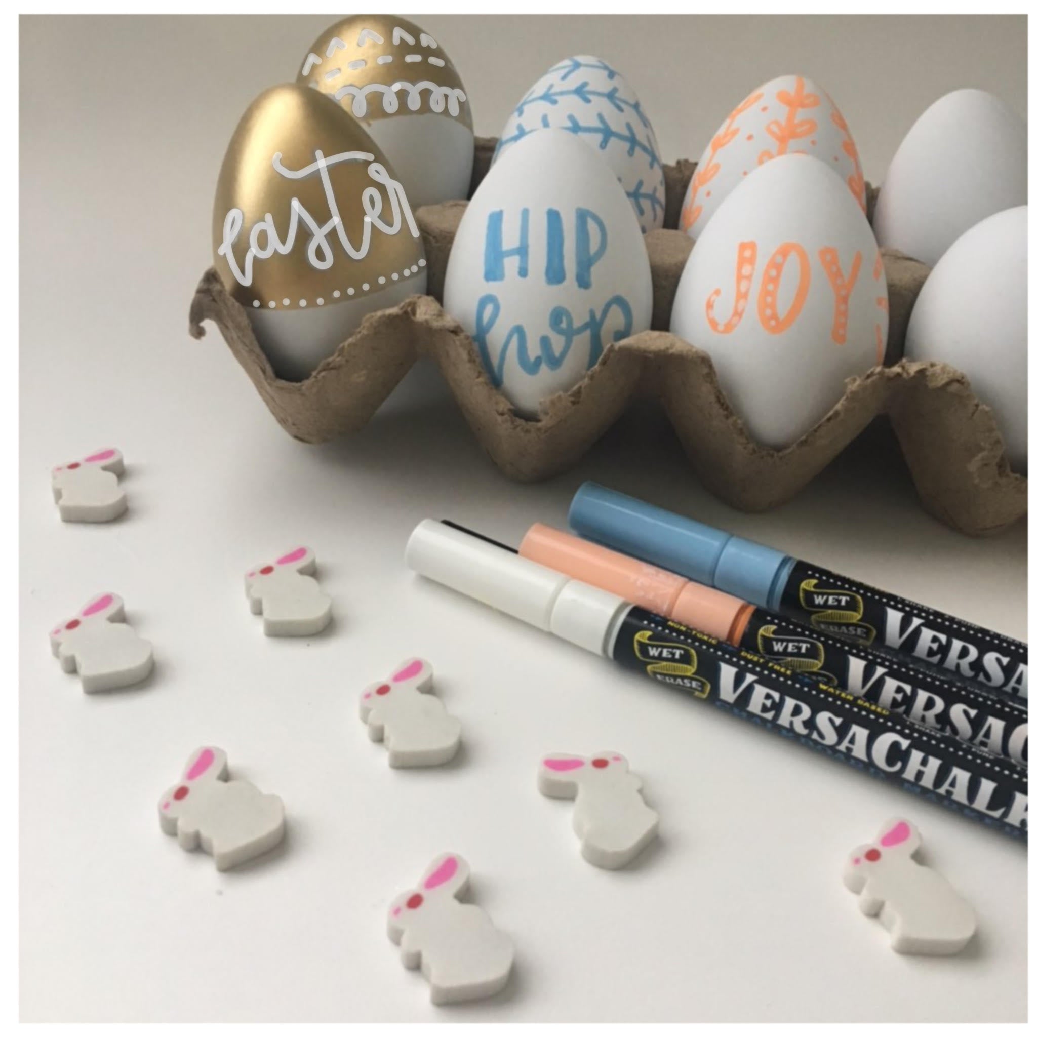
Before creating any design, it’s good to get a feel for the colors you have to work with. As a warm up for my latest A-frame sign project, I took out every VersaChalk marker I own and practiced my lettering to create this colorful demo. Seeing all your colors on display helps you visualize ideas far better than just looking at markers in a box.
Discovering what size to make your letters so the entire alphabet fits perfectly across the chalkboard is also a great exercise in understanding scale. Using chalk markers of different sizes will help you scale any lettering style to the space you have available. You can also use multiple strokes to produce thicker letters. Notice that in my example, the small letters are single stroke, the word “VersaChalk” is written in double-stroke letters and the word “Architect” is biggest of all, with triple-stroke letters.
2. Pencil to Paper Before Marker to Chalkboard!

Chalkboard artists don’t just create amazing designs out of thin air. Most of us sketch out our ideas with pencil and paper first, sometimes creating a few different drafts before pulling out our markers and setting to work on the chalkboard.
I had the honor of creating 10 full-size sandwich board chalkboards for the Mancos Holiday Market in December 2017. The signs were a hit, so the Mancos Creative District asked me to design an A-frame sign for their upcoming “Mancos Melt” event. As you can see, I started with a pencil sketch showing a rough layout with the information they requested for the sign.
3. Test Small Before Going Big

To get both the ink and my creative juices flowing, I like to do a quick mockup on a smaller chalkboard. “Testing small” helps me think about color, focal point, and any changes I want to make to the content or layout of my pencil sketch.
One thing to keep in mind when working with color is that visually, warm colors come forward while cool colors recede. Understanding this effect will help you add 3D depth to your signs. Using contrasting colors that vary in vibrancy will also help your lettering “pop.”
4. It’s Okay to Make Design Decisions on the Fly

Sometimes when you scale your design up to the A-frame board, it doesn’t quite have the impact you thought it would. Trust your instincts and don’t be afraid to make changes. With my Mancos Melt sign, I felt like the dates got lost in the mockup, so I decided to make them more prominent in the final sign. I also integrated the flaming golf ball icon used on some of the posters promoting the event.
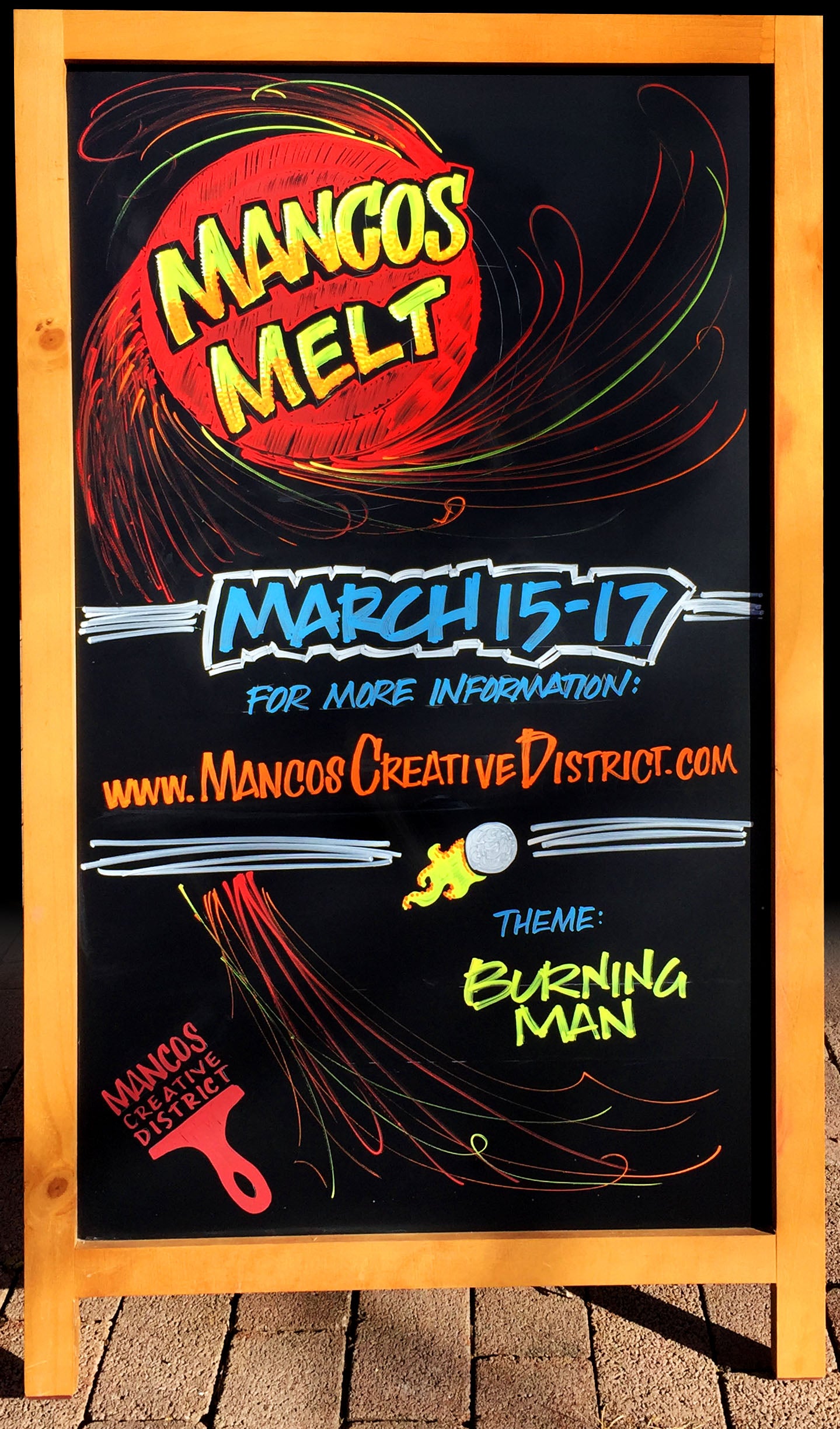
A Pro-Quality A-Frame Sign Made Easy

Here is the final sign I created for Mancos Melt. Note how it draws the viewer’s focus to the key words “Mancos Melt” with 3 layers of color: neon yellow, neon orange and white. I layer them by stippling on the color.

Wondering about the Mancos Creative District logo in the lower left corner of the sign? Here’s a pro tip for you: I created a stencil to use on all of their signs so their brand is consistent. I also laser cut my own templates in plexiglass so I can draw perfect circles, hexagons, and other shapes.

Behind the Scenes: 2 Pro Tips for Killer Chalk Art
Looking for more insider chalk art tips? Here are two tricks of the trade I use for every project.
Find your favorite draft layout tool.

I like to use a white water-soluble pencil for my layout on the chalkboard. The pencil can be erased with either a black eraser or a damp cloth. Sometimes I also mask off the frame and any areas of the board where I don’t want to get any ink.
Make sure your sign is consistent on both sides.

When creating double-sided signs, it’s important to make sure the two sides look consistent. Using my notes from the mockup, I scale up the measurements to layout the first side of the board, then carefully transfer the measurements to mock up the second side. The photo above was from a previous project.
Upcoming A-Frame Sign Design Workshop!
Thanks to all of the positive attention this project has brought me, I will be teaching a 2-day workshop on designing large A-frame chalkboards called Chalk It Up! in March 2018 at Mancos School of the West. We will cover 3 lettering styles, layout and design, working with a variety of materials, how to land projects and managing client expectations. I also have upcoming workshops in Vancouver, British Columbia and St. Paul, Minnesota.
Learn more about Heather Leavitt Martinez at http://www.LetsLetterTogether.com